Add Additional Component Types
The additional component types available in ASSIST will vary by opportunity.
Users should add components for a specific component type in the order in which they should appear within the final application image used by the agency for funding consideration.
NOTE: The order of component types cannot be rearranged once they are added to the application.
To add additional component types:
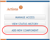
- Select the Return to Application Info button on the Actions panel to return to the Application Information page.
-
From the Application Information page or the Component Information page,
 select the Add New Component button in the Actions panel.
The Add Component page displays.
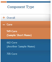
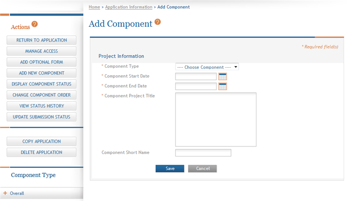
- Select a Component Type from the drop-down list.
- Enter a Component Start Date or select one from the calendar tool. This field defaults to the project start date entered on the Overall component.
- Enter a Component End Date or select one from the calendar tool. This field defaults to the project end date entered on the Overall component.
- Enter a Component Project Title
- Optional: Enter a Component Short Name (up to 20 characters) to help identify the component. This is not a required field.
Component short names -when existing- appear on the Component Information page as well as under the component identifier on the left-side
Component Type navigation panel. Component short names must be unique to the project and can be updated from the Component Information page. Component short names are available only for your convenience in ASSIST and do not carry over to Grants.gov at the time of submission. - Select the Save button to add the component to the application and display the forms associated with the component type selected.
NOTE: Only component types available for the application's opportunity number display in the drop-down list.
NOTE: Selecting the Cancel button cancels the action without saving any information.
Click here for an image of the page.
The Component Information page displays the Component Information (as well as Application Information) as read-only with the status of the component as Work in Progress. Tabs across the top of the page provide access to the applicable component forms.
TIP: Check the Funding Opportunity Announcement text for component-specific instructions for preparing additional components.
After adding the component you have the ability to access:
