avigating the Terms and Conditions User Interface
eRA is migrating the Terms and Conditions module to the new visual appearance adopted by other eRA modules, as part of a required technology upgrade. Some user-friendly features have been added to the screen, although the functionality will largely remain the same. The new look is accompanied by changes that enhance the security and stability of the module.
Read this topic to learn about:
- Header/footer for eRA modules
- Navigation to and within modules
- Actions column and how it might be replaced by an ellipsis (three-dot) dropdown in a row
- Standard tools for tables
- How columns are hidden and shown on small screens
Header and Footer Navigation
The header and footer use symbols to save screen real estate and dynamically adjust to fit smaller screens.

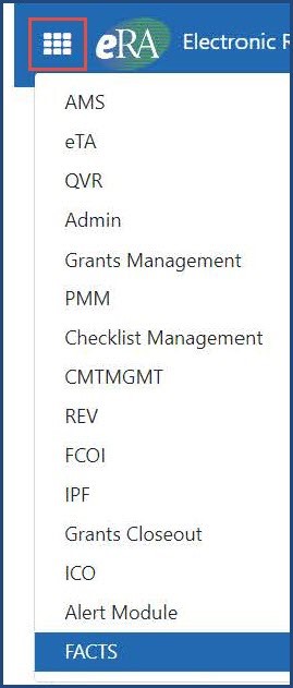
The first icon from left is the Apps menu. The Apps menu shows all apps available to the currently logged-in user:
Other Icons in Header
![]() Links to the Department of Health and Human Services.
Links to the Department of Health and Human Services.
 Link to grants.nih.gov.
![]() Links to a general eRA Service Desk Support page.
Links to a general eRA Service Desk Support page.
![]() Links to eRA Points of Contact page.
Links to eRA Points of Contact page.
![]() The person icon shows your login information, preferences, and sign out link:
The person icon shows your login information, preferences, and sign out link:
![]()
Dynamic Header
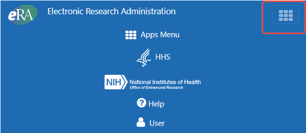
Below, on a narrow screen, most items on the header are hidden, but they pop down when you click the grid icon in the upper right.

Redesigned Footer
The footer is clean and offers only essential information organized into columns.

Navigating Within a Module
The module abbreviation, circled below left, lets you quickly see which module you are working in.

The sections of the modules are listed across the top, with the current section highlighted in gray.
To navigate to the screens available under each section, click the section name to see a drop-down that shows all screen names.

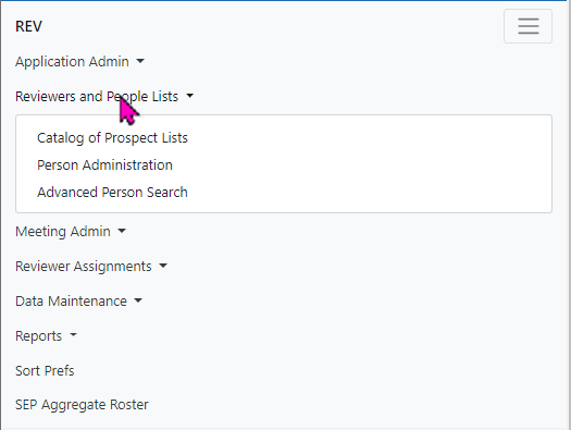
If the screen size is small, all the app section names are collapsed under a three-line icon.

When clicked, the three-line icon shows all module navigation in vertical form.
Actions Column Replaced by Ellipsis Menu
Actions that are available for each row in a table might be displayed under a three-dot ellipsis icon instead of an Actions column, as shown below. This happens if there are three or more actions to be displayed. If only one action item is listed, then the column will list that action as the header and have an ‘x’ in the body of the column.
![]()
Standard Tools for Tables
Tables are sleeker with tools for showing the data you want to see.
Entering filter text features instant filtering of the list as you type, with the number of found results updated as you type. The text you type in filter is highlighted in the table.

Click column headers to sort by that column.
![]()
Navigate to each page of search results using the following tool:

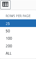
To help avoid scrolling, use the grid tool ![]() to specify how many table rows appear per page.
to specify how many table rows appear per page.
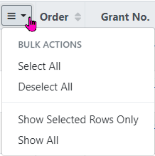
Use the bulk actions tool ![]() to select or deselect all, and to show selected rows only or all rows.
to select or deselect all, and to show selected rows only or all rows.
Use the download tool ![]() , shown below, to export table data to Excel or PDF, or to print.
, shown below, to export table data to Excel or PDF, or to print.

How Screen Size Can Affect Visible Columns
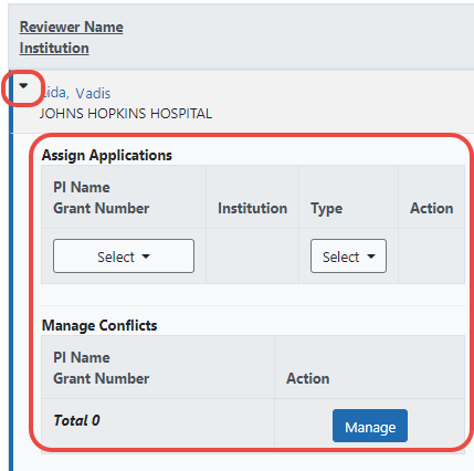
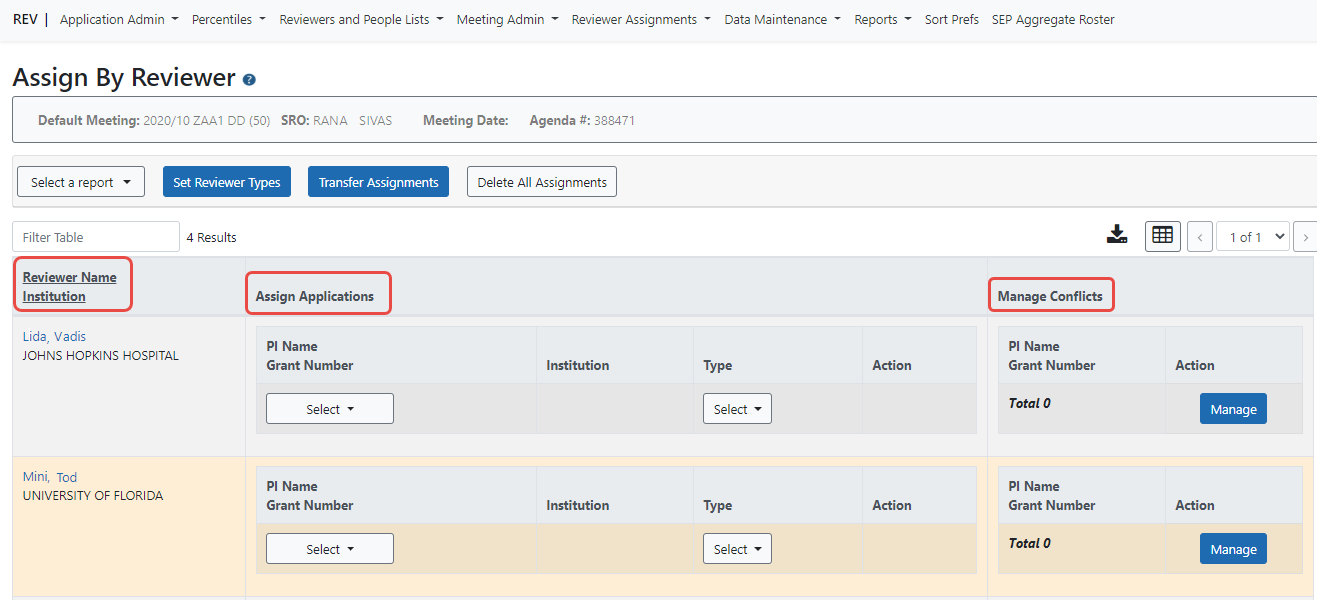
Below, see a full screen, with three columns: Reviewer Name Institution, Assign Applications, and Manage Conflicts.
When the screen is narrowed, the Manage Conflicts column and Assign Applications column are not visible in the table.
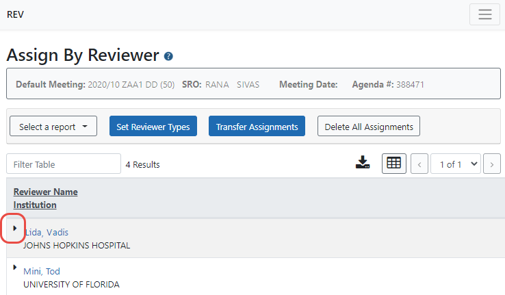
All hidden columns are available by clicking the more info triangle next to the Reviewer Name, which drops down to show the two missing columns:
