Basics and Navigation for eRA Modules
For increased usability, eRA modules are gradually switching to a streamlined, modern, mobile-friendly look and feel for screens. The new look and the new navigation adjust dynamically for a variety of screen or font sizes, making your browsing experience more efficient on the device of your choice. New user interface elements offer a consistent set of tools that you can use across modules. A new header and footer conserve space, leaving more work area for you to accomplish your tasks.
This topic explores the new navigation and user interface elements that you might see on updated screens. All modules will eventually use the same framework for building the appearance and navigation for screens. Older style screens will co-exist with updated screens during the transition to the new look and feel. Not all screen elements shown here will appear in all modules.
Read this topic to learn about:
- Header/footer for eRA modules
- Navigation to and within modules
- Actions column and how it might be replaced by an ellipsis (three-dot) dropdown in a row
- Standard tools for tables
Header and Footer Navigation
A mixture of older and newer headers may appear throughout screens in eRA Modules. During a period of transition, you will see both older and newer style screens in eRA modules.
The new header and footer use symbols to save screen real estate and dynamically adjust to fit smaller screens.

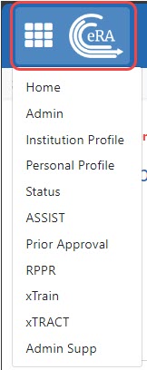
The first icon from left is the Main Menu. The Main Menu shows all apps available to the currently logged-in user, shown below:
Other Icons in Header
![]() Links to the Department of Health and Human Services.
Links to the Department of Health and Human Services.
 Links to grants.nih.gov.
![]() Links to a general eRA Service Desk Support page.
Links to a general eRA Service Desk Support page.
![]() Links to eRA Points of Contact page.
Links to eRA Points of Contact page.
![]() The person icon shows your login information, institution, a link to change your password, email preferences, and sign out link:
The person icon shows your login information, institution, a link to change your password, email preferences, and sign out link:
![]()
Dynamic Header
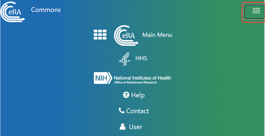
Below, on a narrow screen, most items on the header are hidden, but they pop down when you click the grid icon in the upper right, circled below.

Redesigned Footer
The footer is clean and offers only essential information organized into columns.

Navigating Within a Module
The module abbreviation, circled below left, lets you quickly see which module you are working in.

The sections of the modules are listed across the top, with the current section highlighted in gray, circled above.
To navigate to the screens available under each section, click the section name to see a dropdown that shows all screen names, as shown below.

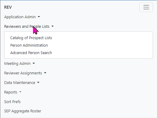
If the screen size is small, all the app section names are collapsed under a three-line icon, shown below.

When clicked, the three-line icon shows all module navigation in vertical form, below.
Actions Column Replaced by Ellipsis Menu
Actions that are available for each row in a table might be displayed under a three-dot ellipsis icon instead of an Actions column, as shown below. This happens if there are three or more actions to be displayed. If only one action item is listed, then the column will list that action as the header and have an ‘x’ in the body of the column.
![]()
Standard Tools for Tables
Tables are sleeker with tools for showing the data you want to see.

Filter Table
Entering filter text features instant filtering of the list as you type, with the number of found results updated as you type. The text you type in the filter field is highlighted in the table.

Selecting Rows/Bulk Action Tool
Use the bulk actions tool ![]() to select or deselect all, and to show selected rows only or all rows. Other bulk action tools might also let you mark or clear the checkboxes of all currently visible rows (such as those found by typing filter text).
to select or deselect all, and to show selected rows only or all rows. Other bulk action tools might also let you mark or clear the checkboxes of all currently visible rows (such as those found by typing filter text).
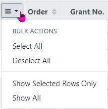
Check All
Check All marks all checkboxes regardless of the number of pages of records shown. In other words, if there are 10 pages of records available, with only the first page currently visible, Check All marks all enabled checkboxes on all pages. By contrast, Check All Visible marks only those enabled checkboxes on the currently visible page. See Page Navigation below for directions on how to navigate between pages of data.
![]()
Column Picker
Click the column picker icon ![]() to choose the visible columns in a table by selecting/deselecting their checkboxes. The column selection is only in effect until you navigate to another screen.
to choose the visible columns in a table by selecting/deselecting their checkboxes. The column selection is only in effect until you navigate to another screen.
![]()
Column Sorting
Click column headers to sort by that column.
![]()
Download and Print
Use the download tool ![]() , shown below, to export table data to Excel or PDF, or to print. Data from all columns is exported/printed even if only a subset of columns are visible.
, shown below, to export table data to Excel or PDF, or to print. Data from all columns is exported/printed even if only a subset of columns are visible.

Rows Per Page
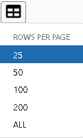
To help avoid scrolling, use the grid tool ![]() to specify how many table rows appear per page.
to specify how many table rows appear per page.
Page Navigation
Navigate to each page of search results using the following tool:

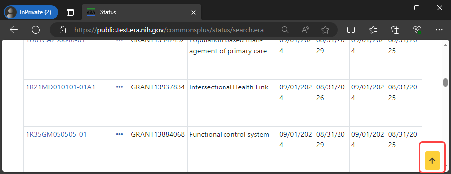
Instantly scroll back to the top of the page by clicking the "Back to Top" button, which appears on selected screens that show long search results. The button is an up arrow in a yellow rectangle and appears at the bottom right of the screen, when applicable:
Expanding Table Rows to Reveal More Details
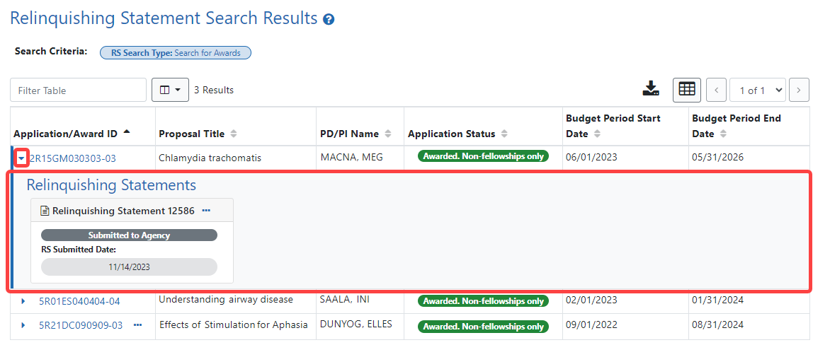
Some tables have an indicator at the beginning of each row that more information can be viewed for the row. If you see a triangle pointing to the right at the beginning of a row, click it for more information on the record.

The triangle turns downwards and expands the row to show additional information.
